9 Pinterest Pin Design Rules That Actually Move the Needle (Without Slowing You Down)
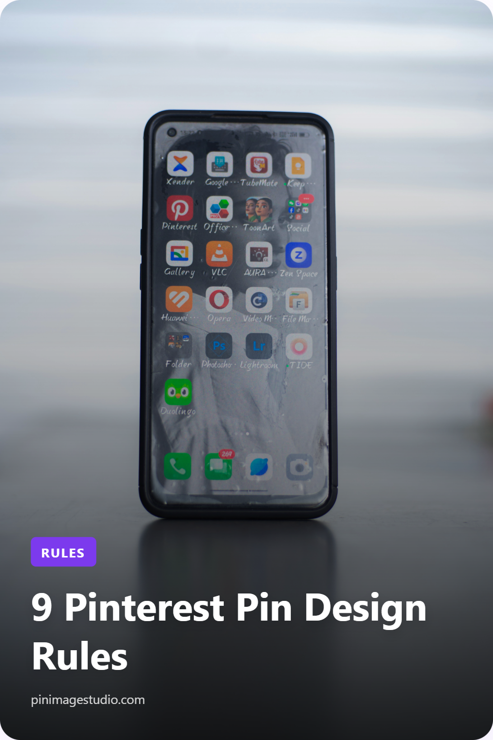
If you have run a Pinterest account for any length of time, you already know the uncomfortable truth: most pins get ignored. They scroll past in a sea of nearly identical images, and the algorithm quietly decides they were not worth showing to more people. The pins that break through are not always the prettiest. They are the ones built on a handful of design decisions that work with how people actually use the platform.
This is not a beginner's guide to "use bright colors." You already know that. This is about the specific, repeatable choices that separate pins that earn saves and clicks from pins that vanish, and how to make those choices fast enough that you can publish consistently instead of agonizing over one pin at a time.
- The 2:3 ratio is not a suggestion
Pinterest is built around vertical content, and the sweet spot is a 2:3 aspect ratio, which means 1000 by 1500 pixels. This is the single most ignored rule by people who should know better.
When your pin matches the native ratio, it occupies the maximum allowable vertical space in the feed without getting truncated. Square pins look small. Overly tall pins get cut off, and Pinterest may suppress them. A correctly sized 1000 by 1500 pin simply takes up more screen real estate, and on a platform where attention is won by occupying space, that is a measurable advantage.
The reason experienced creators still get this wrong is friction. Resizing every image to exact dimensions is tedious, so people cut corners. The fix is to never resize manually in the first place. Start from a canvas that is locked to 1000 by 1500, and the ratio stops being a decision you have to remember.
- Design for the thumbnail, not the full view
Here is the mistake that quietly kills good-looking pins: designing them at full size on a desktop screen. The vast majority of your audience sees your pin as a small thumbnail on a phone, often less than two inches tall, surrounded by competitors.
Before you publish anything, shrink it down. If you cannot read the headline and understand the value at thumbnail size, the design has failed, no matter how elegant it looks at full resolution. Tiny body text, thin fonts, and subtle color contrasts all disappear at the size that actually matters.
The practical rule: your main headline should be readable when the pin is the size of a postage stamp. If you have to squint, increase the font weight, increase the size, or cut the words.
- Text hierarchy beats text quantity
A pin is not a paragraph. It is a billboard. The reader should absorb the core message in under a second, and that only happens when there is a clear visual hierarchy.
That means one dominant element, usually a bold headline, and everything else in supporting roles. A category label or eyebrow text sits small and quiet at the top. The headline dominates the center or lower third. A website name or handle sits modestly at the bottom for brand recognition. When every element competes for attention at the same weight, none of them win.
Strong pins typically follow a three-tier structure: a small category or context cue, a large benefit-driven headline, and a subtle brand marker. Resist the urge to add a fourth and fifth element. White space is not wasted space. It is what makes the headline land.
- Contrast is your unfair advantage
The Pinterest feed is visually noisy. Your pin is fighting for attention against dozens of others, many of them soft, pretty, and low-contrast in exactly the same way. High contrast is how you interrupt the scroll.
This applies in two places. First, contrast between your text and its background. Light text on a busy photo is unreadable, so use a gradient overlay, a solid color band, or a semi-transparent shape behind the words. Second, contrast between your pin and the feed around it. If everyone in your niche uses muted pastels, a bold dark pin with a punchy accent color will stop thumbs. Counter-programming the visual norm of your niche is one of the most underused tactics in Pinterest design.
- Treat templates as a system, not a crutch
There is a myth among creators that templates make your content generic. The opposite is true when used correctly. Templates are what let you maintain quality and consistency at volume, which is the only way Pinterest actually rewards you. The platform favors accounts that publish steadily over time, not accounts that post one perfect pin a month.
The trick is to maintain a small library of distinct templates rather than one. If you publish three pins for a single piece of content, using three different layouts gives you visual variety while keeping the same underlying quality standard. One might be a full-bleed photo with a text overlay, another a split layout with a colored text panel, and a third a bold text-forward design with no photo at all. Same brand, same message, three different shots at catching different users' attention.
This is precisely the workflow that tools like PinImage Studio are built around: pick a proven template, drop in your headline and image, and produce a polished 1000 by 1500 pin in seconds rather than rebuilding a design from scratch every time.
- Brand consistency compounds over time
Individual pins win clicks. A recognizable brand wins follows, and follows are what turn Pinterest from a one-time traffic spike into a compounding channel.
Consistency does not mean every pin looks identical. It means a viewer who has seen your pins before recognizes the next one instantly. That recognition comes from a small set of repeated signals: a consistent accent color, a consistent font pairing, and a consistent placement of your website name or handle. When someone sees three of your pins over a few weeks and the visual language matches each time, you stop being a random image and start being a brand they trust.
Pick a brand color and actually use it as your accent across pins. Pick one or two fonts and stick with them. Put your site name in the same spot every time. These are not creative limitations. They are the cues that make your content cumulative instead of disposable.
- Build variety into every piece of content
Pinterest's own guidance encourages fresh pins, and the algorithm responds well to multiple distinct images pointing to the same destination. This is a gift for anyone who thinks in systems.
For every blog post, product, or landing page you promote, create several pins rather than one. Vary the headline angle, the image, and the template. One pin might lead with a number ("9 rules"), another with a question, another with a bold benefit statement. Each variation is a fresh test of what resonates, and because they look different, Pinterest treats them as distinct fresh content rather than duplicates.
The creators who win on Pinterest are rarely the ones with the single best pin. They are the ones running the most shots on goal, consistently, with a quality floor that never drops. Variety plus consistency is the whole game.
- Choose images that read instantly
Photo selection makes or breaks a pin, and the rule is the same as everything else here: clarity at small size. A busy, cluttered photo becomes mud at thumbnail scale. A clean image with a clear focal point and some breathing room around it survives the shrink.
Look for images with negative space where your text can live without fighting the subject. Bright, well-lit photos outperform dark, moody ones in the feed, not because they are better photos, but because they are more legible at a glance. And if a strong photo is not available, do not force one. A bold, text-forward design on a solid brand-colored background often outperforms a weak or generic stock photo. Sometimes the best image is no image at all.
- Make speed a feature of your process, not an afterthought
Every rule above is worth nothing if applying it takes so long that you only publish occasionally. This is the part most design advice ignores. Quality and consistency are not in tension on Pinterest. They are both required, and the only way to have both is a process fast enough to sustain.
That means eliminating the repetitive friction: resizing to 1000 by 1500, rebuilding layouts, hunting for the right text placement, exporting at the right dimensions. When those steps are automated or templated, you free up your judgment for the decisions that actually matter, like the headline angle and the image choice. The goal is a workflow where producing five strong, on-brand, correctly sized pins takes minutes, not an afternoon.
This is the entire premise behind PinImage Studio. The fixed-ratio canvas, the library of proven templates, the editable brand elements, and the one-click export to a perfect 1000 by 1500 PNG exist so that following these design rules stops being a chore and becomes your default. You design well because it is fast, not in spite of it.
The takeaway
Strong Pinterest design is not about artistic talent. It is about a short list of decisions made consistently: the right ratio, thumbnail-first legibility, clear hierarchy, bold contrast, a system of templates, brand consistency, built-in variety, clean imagery, and a process fast enough to keep doing all of it. None of these are secrets. The advantage goes to whoever applies them reliably, at volume, week after week.
Pick one rule from this list that you are currently ignoring, and fix it on your next batch of pins. Then pick another. Within a month, the difference in saves and clicks will be obvious, and you will have a repeatable system instead of a pile of one-off designs you had to fight for.
Ready to put these into practice without the busywork? Try PinImage Studio and turn a headline and an image into a scroll-stopping pin in seconds.